Top 7 Data Visualization Tools for Your Business in 2023
Data visualization tools help you engage site visitors and provide them with more information about your business.
Visualization keeps people interested in your pages so that they spend more time getting to know your business. This leads to more lead conversions for your business down the line.
So, what are the tools for data visualization for your business? On this page, we’ll discuss the top seven data visualization tools for 2023 you can use to create great visuals for your audience.
So, just keep reading!
Don’t miss our Marketing Manager Insider emails!
Join 200,000 smart marketers and get the month’s hottest marketing news and insights delivered straight to your inbox!
Enter your email below:
“*” indicates required fields
(Don’t worry, we’ll never share your information!)
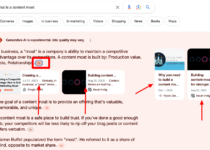
What is data visualization?
Data visualization is the processing of taking a group of data and turning it into a visual graph, chart, infographic, or other visual graphic to make the data easier to understand and interact with.
What are data visualization tools?
Data visualization tools are platforms that make it easy to turn your data into beautiful graphics and visual charts. They typically involve entering or linking your data to the platform, and then choosing a graphic that you like best from a generated list.
The 7 best data visualizations tools of 2023
Our favorite tools for data visualization in 2023 are:
Explore the table below for a quick comparison, and then keep reading below for an in-depth breakdown of each tool!
| Tool | Customer Rating | Pros | Cons | View More |
| Tableau | 4.6/5 | User interface, Mobile responsiveness, connectivty with multiple data sources | Pricing, No report scheduling functions | Learn More |
| Infogram | 4.5/5 | Real-time data, Personalized features, Interactive media | Free plan can’t download visuals, needs an internet connection | Learn More |
| Qlikview | 4.3/5 | User-friendly interface, Colorful visualizations, | Poor customer support, Lack of drag and drop features | Learn More |
| ChartBlock | 4.7/5 | No coding experience, Easily share your visuals | Templates can sometimes be hard to use, Limited font selections | Learn More |
| Datawrapper | 4.3/5 | User-friendly , Data set personalizations, | Limited flexibility when working with visuals, Tricky to customize fonts and colors | Learn More |
| Google Charts | 4.6/5 | Compatibility with other Google tools and products, Easily integrate data | The export feature could use some fine-tuning, It lacks customization features | Learn More |
| Sisense | 4.5/5 | Helpful customer support, It can handle massive data sets, Seamless customization | Tricky to develop and maintain analytic cubes, Doesn’t support time formats | Learn More |
1. Tableau
Tableau is a popular data visualization tool used by many businesses. This is a tool that produces interactive visualizations that your audience can interact with.
The pros of Tableau
Some of the biggest pros of Tabluae are it’s:
- User interface
- Mobile responsiveness
- Ability to support connectivity with diverse data sources
If you have large data sets, this is the tool for you. Also, if your data is constantly changing, it has the capability to keep up with those changes.
Tableau is a popular choice because it makes it simple for your audience to understand the information by producing charts that are easy to read and understand. If you are looking for a tool that is easy to use, Tableau is a great option.
The cons of Tableau
A few cons of Tableau include its:
- Pricing, which can be slightly on the higher side
- Lack of report scheduling functions
2. Infogram
Infogram is another great data visualization tool. It has many great features that help you make the most of your data visualization using templates to help you build your visuals.
The pros of Infogram
Some key pros of Infogram are that you can:
- Link real-time data to the platform
- Personalized features to your visuals
- Implement interactive media
One feature of this tool is that you can link real-time data to your graph, which means that the data is always up to date and changing to show the most recent data. This is a great feature to have because you will keep your consumers updated on new information regarding your business’s services, products, or both.
Another great feature of this tool is that you can add personalized features to your charts like charts, maps, images, and videos. This enables you to enhance your content using interactive media to make it better for your audiences.
By using Infogram, you will be able to create more interesting data visualizations for your business.
The cons of Infogram
Here are a few cons of Infogram:
- You have to upgrade your plan to download your graphics
- You’ll need to have an internet connection to use the paltform
- It’s difficult to create complex visualizations
3. Qlikview
Qlikview is a great tool that includes a wide range of features that help you create more customized data.
The pros of Qlikview
A few key pros of Qlikview are its:
- User-friendly interface
- Colorful visualizations
- Ability to combine data sources
This tool has numerous data visualization capabilities for your business, including analytics, business intelligence, and enterprise reporting.
One of the best features of this tool is that you can combine all sources of data. Many tools restrict you to only certain sets of data, but this tool enables you to combine different sets so you can look at all your data together.
Qlikview is a great tool to help you combine all your data together into one visual.
The cons of Qlikview
Some key points letting Qlikview down are its:
- Poor customer support
- Lack of drag and drop features
- RAM limitations
4. ChartBlocks
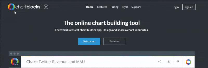
If coding isn’t your specialty, ChartBlocks is a great tool for your business.
The pros of ChartBlocks
Here are some key ChartBlocks pros:
- It requires no coding experience
- You can import data from any source
- You can easily share your visuals
This tool requires no coding, which makes it an easy tool to use.
ChartBlocks uses databases, spreadsheets, and live feeds to build your visualizations. It takes all this information for you and pieces it all together in the visual.
These charts are a great option for sharing, too, because they are compatible with any screen size. Regardless of the device you use, your chart will adjust to the device and look great.
If you want to share your charts on social media, you can do that, too. ChartBlocks makes it easy to share your data visualizations on Twitter and Facebook. This is a great opportunity for you to share your data with people on networking platforms.
ChartBlocks is a simple and easy to use tool to help you create professional, sharable data visualizations.
The cons of ChartBlocks
Here are some of the main cons of ChartBlocks:
- Templates can sometimes be hard to use
- It can be challenging to navigate the functions and formatting
- There are limited font selections
5. Datawrapper
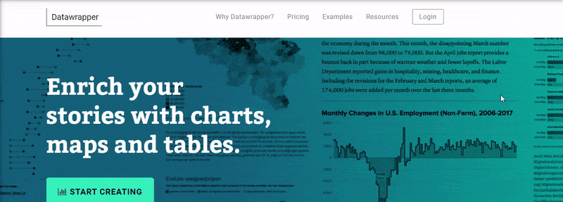
This tool is another one that doesn’t require any coding experience. Datawrapper is a data visualization tool that is aimed at publishers and journalists, but still poses great benefits for your business.
The pros of Datawrapper
The main pros of using Datawrapper include its:
- User-friendly features and interface
- Data set personalizations
- Ability to easily embed visuals into your website
It has a simple interface that makes it easy for you to upload your information and generate a chart. This tool allows you to personalize your data set for custom layouts, as well.
Datawrapper makes it easy to create visualized data sets and embed your chart into your site. Use this tool to upload your data and create charts and maps that catch your audience’s attention.
The cons of Datawrapper
Now let’s take a look at some Datawrapper cons:
- There is limited flexibility when working with visuals
- It can be tricky to customize fonts and colors
- It’s challenging to create maps because you will need to have a little programming knowledge
6. Google Charts
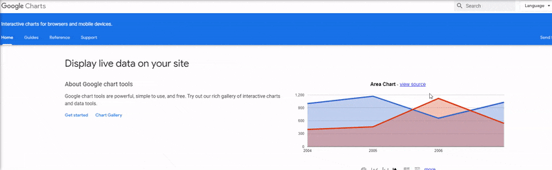
Google Charts is a great tool that helps you create charts based on your data and is a great option for your business if you want a user-friendly tool.
The pros of Google Charts
Some key pros of Google Charts include its:
- Compatibility with other Google tools and products
- Ability to easily integrate data
- Engaging visual graphics
The best features of these charts are that they are interactive and zoomable. This is very appealing to your audience because it gives them the opportunity to interact with the data and ultimately keeps them on the page longer.
If you want your audience to interact with your data, Google Charts is a very flexible option for your business. Create engaging data visuals featuring interaction controls and animation with this tool to keep your viewers attentive and happy.
The cons of Google Charts
Here are a few cons of Google Charts:
- The export feature could use some fine-tuning
- It lacks customization features
- There are inadequate demos for the tools
7. Sisense
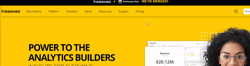
Sisense is an analytics platform that helps you create data visuals for your business. This unique platform is user-friendly, efficient, and creative.
The pros of Sisense
Check out these Sisense pros:
- Helpful customer support
- It can handle massive data sets
- Seamless customization
You have full control over the customization of your chart, allowing for maximum efficiency. For example, this tool allows you to easily drag and drop information and data into your chart. You can make your charts as simple or as complex as you would like it because of this effective feature.
In addition, this enables you to be more creative with your charts by adding engaging and personalized elements. Using these elements, you will produce more interactive charts that keep your audience’s interest.
You can also use multiple sources of data. Sisense allows you to gather all the sources of data into one place, which is a great way to create more intricate and interesting visuals.
If you are looking for a tool that gives you more control over your data visuals, Sisense is a great option for your business.
The cons of Sisense
Now let’s explore the cons of Sisense:
- It can be tricky to develop and maintain analytic cubes
- Doesn’t support time formats
- There are limited visualization versions
Visualize a plan with WebFX
Visualizations are a great way to present a large chunk of data to your business’s audience, which is why data visualization is so effective in engaging and converting leads. With these data visualization tools, you can easily present data to your audience.
At WebFX, we know the value of data visualization. We have a team of 500+ experts that will help you create impactful visualizations for your data. Our team will help you create visualizations that engage your audience and get them to interact with your business.
If you are ready to start engaging your leads with data visualization, contact us online or call us today at 888-601-5359 to speak with a strategist!
We look forward to helping your business grow!