The Power of Data Visualization: Insights, Tools, & Best Practices
Data is everywhere, but making sense of it is another challenge altogether. This is where data visualization comes in—transforming raw numbers into engaging visuals that tell a compelling story. As businesses rely more on data-driven decision-making in 2025, the demand for clear, intuitive, and interactive visualizations continues to grow.
Visual data, from business intelligence and dashboards to interactive infographics, improves comprehension, engagement, and strategic decision-making. In fact, 77% of organizations using data visualization tools experience optimized decision-making, while teams using visualization tools are 43% more effective in making data-driven choices.
This article explores the latest data visualization statistics, emerging trends, and technologies shaping the industry. You’ll discover how visual search statistics and data democratization tools transform how businesses leverage information for maximum impact.
Cognitive Processing and How the Brain Processes Data
When it comes to absorbing information, your brain doesn’t want to read—it wants to see. That’s because the human brain is hardwired for visual processing. In fact, more than 50% of the cortex—the outer layer of your brain—is dedicated to interpreting visual input (Rochester). This anatomical design shows just how much our cognitive system depends on visuals for speed and clarity.
How fast can your brain really process what you see? Research shows it takes as little as 13 milliseconds to recognize an entire image (MIT News). That means a chart, graph, or infographic can communicate a trend or insight before your brain even begins decoding a paragraph. Compared to text, visuals are processed 60,000 times faster (National Center for Biotechnology Information).
Here’s another staggering figure: the brain visually analyzes 90% of information (MIT Sloan Review). That’s why data visualization is so effective—it taps into the brain’s preferred learning system. When you present data in visual form, you’re not just decorating it; you’re making it cognitively accessible.
The Importance of Data Visualization
How Data Visualization Impacts Decision-Making
- Organizations that use data visualization along with storylines improve decision-making, leading to a 28% accuracy. (Lumivero)
- 64% of presenters who used overview maps in their presentations made immediate decisions, demonstrating the power of visual aids in the decision-making process. (Amanet.org)
A study found that presenters who combined visual and verbal elements in their presentations were 17% more convincing for their audience compared to those relying solely on verbal communication (Amanet.org)
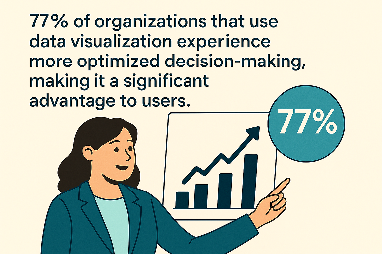
- 77% of organizations that use data visualization experience more optimized decision-making, making it a significant advantage to users. (SAS, Scribd)
- Groups using visual language increased their ability to reach consensus by 21% compared to groups that did not use visuals (Amanet.org)
Benefits for Business Intelligence and Communication
- Data visualization shortens meeting times by 24%, improving an organization’s efficiency and effectiveness. (Amanet.org)
- A study found that teams using visualization tools are 43% more effective in persuading their audience to take action. (Amanet.org)
- The Wharton School of Business found that while verbal presentations only convince 50% of an audience, that number increased to two-thirds or 67% when they added visuals. (South Oregon University)
- A case study on analytics found that business intelligence using data visualization will offer an ROI of $13.01 for every dollar spent. (NucleausResearch)
- In 2019, the global data visualization market size stood at USD 8.85 billion and is projected to reach USD 19.20 billion by 2027, exhibiting a CAGR of 10.2% during the forecast period. (Fortune Business Insights)
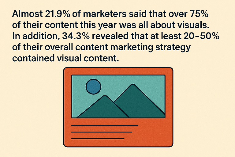
- Almost 21.9% of marketers said that over 75% of their content this year was all about visuals. In addition, 34.3% revealed that at least 20-50% of their overall content marketing strategy contained visual content. (Venngage)
- 41% of working teams saw enhanced collaborative skills and sharing of information (SAS, Scribd)
- In the first year alone, organizations that used a dashboard to visualize electronic health record data reduced 65% in time spent on data analysis. (Libertpub)
- 74% of businesses that use data discovery provide their users to make changes to the analytics environment as needed. (Tableau)
Impact on User Engagement
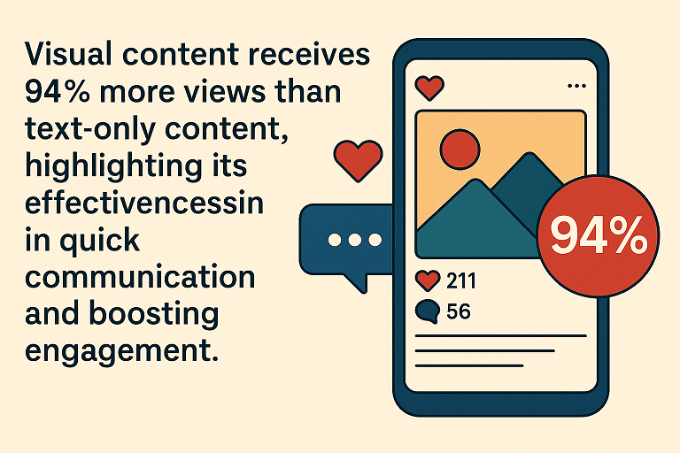
- Visual content receives 94% more views than text-only content, highlighting its effectiveness in quick communication and boosting engagement. (Content-whale)
- Infographics are 3 times more likely to be liked and shared compared to other content types, making them easily sharable and generating lots of buzz on social media. (Reusser)
- Presentations with highlight color increased reading comprehension by 14% compared to those just using bold text. (Office.xerox)
- Adding color can increase prospects and potential customers’ comprehension by as much as 73%, speeding sales presentations. (Office.xerox)
- Color used in content like direct mail pieces and collaterals leaves an impression that is 39% more memorable, making up follow-up calls more successful. (Office.xerox)
- Information that uses color can be located 70% faster. This helps executives understand important information faster, improving your company’s efficiency. (Office.xerox)
Data Visualization Statistics
Global Trends
- 75% of organizations use data visualization tools in analytics workflows. (Venngage)
- In one survey, organizations that use performance dashboards report a 35% improvement in employee productivity. (HumanSmart)
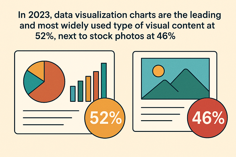
- In 2023, data visualization charts are the leading and most widely used type of visual content at 52%, next to stock photos at 46% (Venngage)
- 25% of marketers plan to try first-party data collection as a marketing strategy to engage with consumers and form deeper connections. (Hubspot)
- In 2019, the Information Technology and Telecomm is the leading industry by market share (Statista)
User Engagement Metrics
- Viewers can retain 65% of the information paired with a relevant image after three days, compared to 10% of the information they hear. This shows that individuals remember visuals more than text alone. (StoryChief)
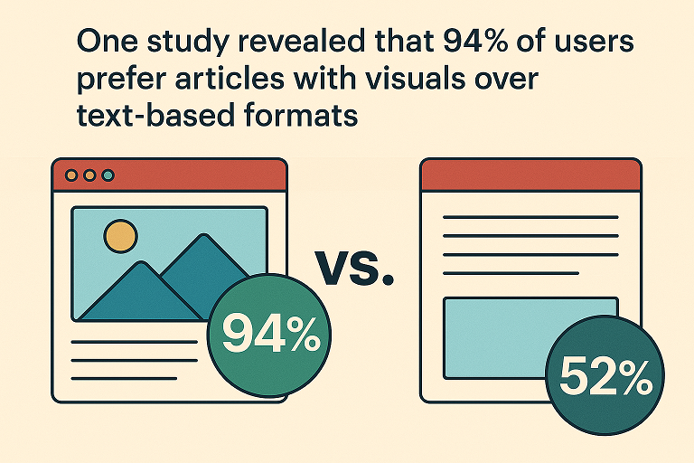
- One study revealed that 94% of users prefer articles with visuals over text-based formats. (Sproutworth)
- 65% of visual learners make up the general population. (Papers)
- Users retain only 10-20% of written or spoken information after three days, but they remember almost 65% when it is paired with visuals. (Changingminds)
- On the average web page, users make time to read 28% of the words during an average visit, while users will more likely only read 20%. (Nngroup)
- The most-ever read online story in The Washington Post is a visualized story on why outbreaks like coronavirus spread exponentially and how to “flatten the curve.” (Poynter)
Technological Advancements
- 67% of businesses use interactive dashboards to find timely information for data analysis. (Tableau)
- Companies that leverage visual data discovery provide analytics access to 48% more of their employees (Tableau)
- Visual data discovery tools enable 48% of BI users to find the insights they need on their own—no IT support is required. (Tableau)
- 86% of those currently working in digital experience use traditional web analytics, while 84% are collecting feedback through online surveys and forms. More than half (56%) use A/B testing in their digital experience approach. (ContentSquare)
- According to 52% of workers in data visualization professions, there is something about their work that their colleagues don’t comprehend. (Dataninja)
- 6 in 10 data visualization professionals (61%) still have access to at least $1 in professional development funds, while another 13% have $0 but still have professional development plans. (Dataninja)
Emerging Technologies in Data Visualization
AI and Machine Learning
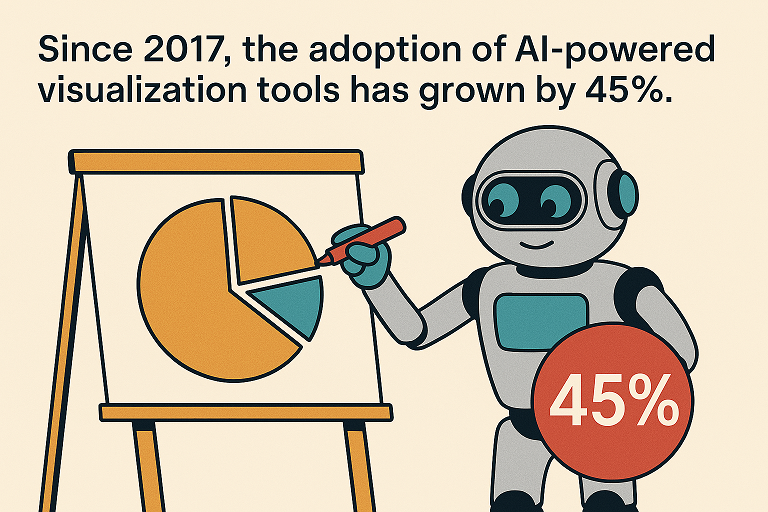
- Since 2017, the adoption of AI-powered visualization tools has grown by 45%. (GlobalBusiness)
- AI tools improve data interpretation accuracy by 48%. (ExplodingTopics)
- 48% of companies now use AI-driven visualization platforms. (ExplodingTopics)
- 74% did not use AI in their data visualization work, while 24% used AI in their data visualization work 2% were not sure (Dataninja)
Augmented and Virtual Reality (AR/VR)
- AR-based visualization tools increase understanding of data by 30%. (Vorecol)
- VR improves decision-making teams’ ability to explore data in real-time. (Immersia)
Data Democratization Tools
- 58% of organizations leverage self-service tools to empower non-technical users. (Acceldata)
- 36% of data visualizers prefer Tableau as their favorite tool, considerably outperforming other options. (Dataninja)
- 45% cited the topic of ad-hoc data as one of the most improved skills among analysts. (SAS, Scribd)
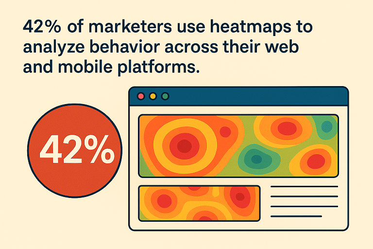
- 42% of marketers use heatmaps to analyze behavior across their web and mobile platforms. (ContentSquare)
- 44% of brands have a dedicated data science team, while 52% have teams focused on digital analytics and insights. (ContentSquare)
- The five most common tools for data visualizers are Excel 71%, Pen & Paper 58%, PowerPoint 54%, Tableau 38%, and Google Sheets 38%. (Dataninja)
How Businesses Can Leverage Data Visualization
Boosting Business Intelligence
- Organizations using data visualization tools report a 70% increase in actionable insights. (Vorecol)
- 20% did data visualization as freelancers, while 57. 74% of data visualization professionals did data visualization as an employee. (Dataninja)
- 33.2% of professionals who perform data visualization in their roles indicated a job title containing the word “data.” Meanwhile, 27.3% held a job whose title contained “analyst,” “analytics,” or “analysis,” and 15.3% reported a job title with some form of “visual” in the job title. (Dataninja)
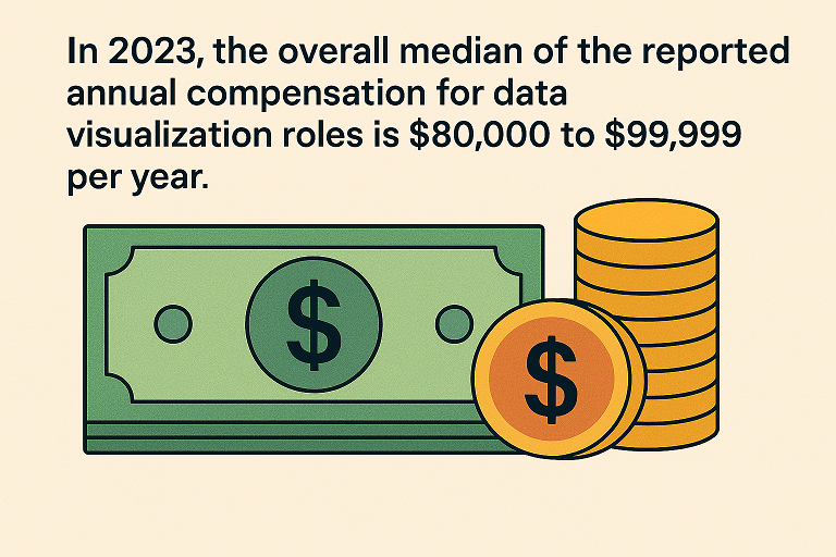
- In 2023, the overall median of the reported annual compensation for data visualization roles is $80,000 to $99,999 per year. (Dataninja)
- Despite over half of those surveyed (53%) claiming that businesses can never have ‘too much’ data, many also admit that they have little idea what they should and shouldn’t be paying attention to. (ContentSquare)
- More than 95% of businesses face the need to manage unstructured data, with over 40% of businesses saying they must do so on a frequent basis. (Forbes)
- 71% of domain experts desire to improve their ability to analyze and comprehend data. (SigmaComputing)
Improving Communication
- Visual storytelling improves audience retention by 68%. (Springer)
- Presentations with visuals are 43% more persuasive. (Web.archive)
- To learn new data visualization skills, 84% of respondents collectively reported that it would be most beneficial to “Work through a project,” and 67% prefer to engage with “Examples.” (Dataninja)
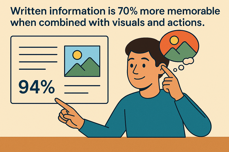
- Written information is 70% more memorable when combined with visuals and actions. (Amanet)
- Visual language improves problem-solving effectiveness by 19%. (Amanet)
- Visual language produces 22% higher results in 13% less time. (Amanet)
- 323% of people do better at following directions with text and visuals compared to those without illustrations. (Forbes)
Enhancing Customer Engagement
- User engagement rates are boosted by 47% with interactive visuals. (Outgrow)
- Data-driven visuals improve website conversion rates by 86%. (Conversion rate)
- 91% of consumers prefer visual information over text-based content. (Demandgenreport)
- According to 43% of marketers, the best visual content is creative images, such as infographics and illustrations. (Venngage)
- 91% of customers prefer visual content over written content. (Web.archive)
- Users pay attention to information-carrying images with relevant content to the task at hand, ignoring purely decorative images. (Nngroup)
- Only 26% have invested more than $1 million in analysis of internal data. (Cio, PWC)
Challenges in Data Visualization
- Up to 50% of marketers find it challenging to find the right design layout for their data, statistics, or copy. (Venngage)
- 34% of respondents feel that they are not effective at uniting data from their websites with data from their mobile sites. This rises to 39% for uniting data from websites and mobile apps. (Content Square)
- 54% don’t believe they have a strong understanding of their customer’s behavior across digital channels (Content Square)
- 28% don’t turn in-page data into actionable insights (Content Square)
- 45% of data experts say they struggle to interpret domain experts’ data questions or needs. (Sigmacomputing)
- 14% of marketers face challenges with having low-quality data. (Hubspot)
- In a survey, 36% of data specialists believe domain experts do not comprehend what can and can’t be done with data. (Sigmacomputing)
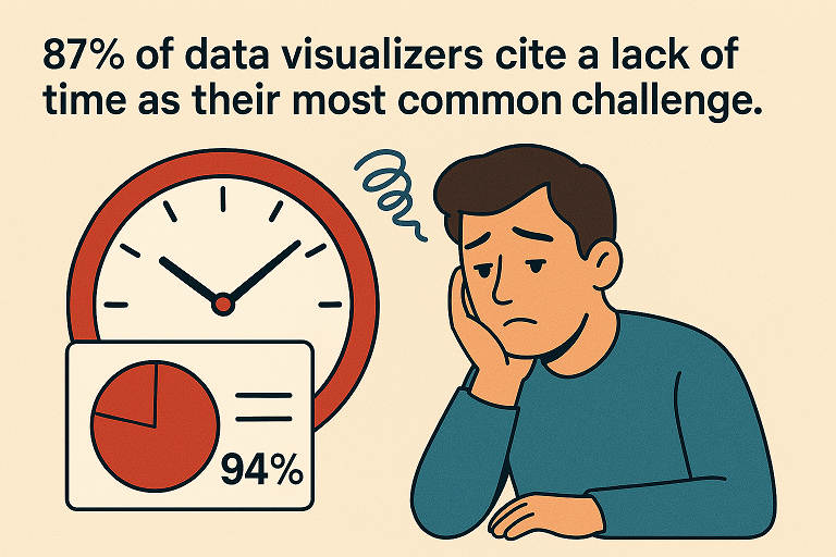
- 87% of data visualizers cite a lack of time as their most common challenge. (Dataninja)
- 27% of data experts report feeling unsatisfied with their roles. A major contribution is their high volume of low-value ad hoc reporting requests, which takes up a large portion of their time. Meanwhile, 76% of data experts say they spend 49% of their time preparing ad hoc reports for business teams. (Sigmacomputing)
The Future of Data Visualization
Businesses who use data visualization can transform raw data into meaningful insights to efficiently make well-informed decisions. Leverage the right tools, follow best practices, and integrate visualization into daily operations so you can improve decision-making and empower your teams to think critically about data.
Set clear objectives, choose the right chart types, maintain design consistency, and incorporate interactivity to engage stakeholders. Visual data goes beyond presenting numbers or statistics—it drives conversations, strengthens strategies, improves storytelling, and fuels business growth in an increasingly data-driven world.
Ready to elevate your data strategy? For more insights, follow us on Facebook, LinkedIn, Twitter, and Instagram.